I love this game! It's just that from my viewpoint it displays all the problems most turn-based RPGs usually suffer from, and whatever the reason for this to be so, it's something that can be easily rectified. Here's how I'd do it.
Believability. So, where do I begin with this one? Well, quite basically what I think is this: a few game mechanics don't help in making the world a credible one! The most glaring example of this is the fact that when moving around in a village or dungeon we can only see Vyse, even though that character represents the whole party! This is the first thing I'd do differently: show every party member at all times. Emphasize the fact that this game is about a team. Grant players the ability to control whomever they want from this team, and make the other party members follow along. This has the added advantage of allowing the implementation of a simple multi-player mode, where each player controls a party member (even during combat). Now, because the team size varies throughout the game as the story develops, this option works best if the maximum number of simultaneous players is the absolute minimum number of characters in the party: two, in this case. And as far as credible movement is concerned, I'd definitely remove that 'bounding box' feel that Vyse gives off when close to walls, or cliffs, or other obstacles. How? Well, his pace should become much slower in those situations, indicating that running against walls, even diagonally, is a real struggle! He also displays a mild case of Mr. Butter Feet when walking slowly that I find unacceptable. Finally, in order to shorten the rather boring process of travel, I'd try to make him move in a more fluid and energetic manner, in particular when climbing ladders or running.
Next come the random battles. Being random is OK, being unexpected is what I don't like. Unexpected in the sense that you're happily wandering down a seemingly empty corridor in one minute, and suddenly POW! a whole bunch of enemies materializes from nowhere and you enter battle mode in the next. I mean, where did all these beasts come from, if they weren't there in front of me before?! (This is different from players passing under a tree and being attacked by snakes that drop from above, which I think is a good unexpected!) Paper Mario corrects this invisibility of bad guys to some extent by representing a (potential) battle with the presence of a single enemy, but I'd go all the way and actually show all the enemies of a battle ahead for players to see what they may be getting themselves into. If in a vast open area, this implies that every important battle and respective enemy formation that will possibly occur in that area needs to be determined/built when players first enter it, and not as they go along. It also means that corridors and other locations need to be more spacious in order to accomodate all the extra characters, and this brings me to my next important change: don't make the battles occur on a different stage! To me, this really kills any sense of being there, and I'd simply remove this feature! It's too 'gamey'! Players could instead see a bunch of enemies in the distance, approach them or be approached by them, and when near enough immediately enter battle mode. I'd remove the need to change to a different stage, but I'd retain the signals that warn players they have just entered combat mode (which, besides the music being different, could be a pair of crossed swords zooming in into the screen, for example). And finally, I think that characters shouldn't inexplicably loose their status anomalies when a battle is over. It is a rule that is way too artificial, and for me it is best if those anomalies fade away with the passing of time.
The last point I'd like to make about creating a believable athmosphere concerns the use of overworld maps. This is best seen when compared to a Legend of Zelda game. In The Wind Waker, when Link jumps into his boat, the action doesn't change into an overworld map, and neither should that happen to Vyse and company when they board their ships. I think that the action should instead be continuous, flowing naturally as if boarding ships and beginning to steer them is seen as a necessary everyday extension of walking about on foot on an island. In my book, overworld maps are really utterly forbidden artifacts. Of all the issues I've described in this section, this is the single most important thing in a game that destroys the sense of being in a credible world. It's an extra layer of detachment that makes players loose touch with their characters. I'd dump it! Period. Despite of this change, and quite unlike what happens in The Wind Waker, where players can leave the King of Red Lions anywhere and jump off and swim almost everywhere, I'd still let the interface between character mode and ship mode in Skies of Arcadia Legends occur only at the harbours. Only at these points can players enter or leave the ship.
And here's a neat little touch to make things that little extra cooler: I'd make weapons emanate the element associated with their current attribute, instead of changing their colour. For example, if a weapon's current attribute is red, then it could become shrouded in flames instead of becoming red, if the attribute is yellow, sparks and small bursts of lightning could be coming off from the blade instead of it becoming yellow, and so on. Wouldn't this be cool?
 |
 |
Screens and Menus. Some of the things I said so far and my own personal tastes mean it's rough sketch time again! I'm going to show you how I'd place all the screen elements for the main modes that can occur in the game.
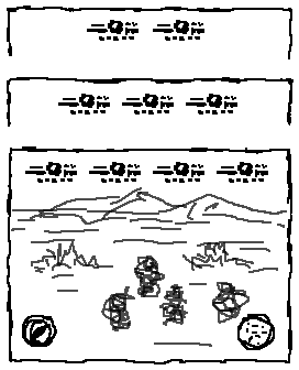
And to the left above you can see the screen that is displayed when players are moving about on foot. At the top there's a bunch of relevant details about every party member. And wether there are two, three, or four characters in the party, those details are always centered on the same line and at the same distance from each other. The info shown per character on the team is the face, name, level, HP, MP, status conditions, and also which player, if any, is controlling that character. Finally, at the bottom of the screen goes the compass, to the left, and the map, to the right. Everything is similar when they're inside a ship, except for the added altimeter and ship info, which probably looks best if placed at the bottom center, between the compass and the map.
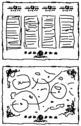
Now, when Player 1 (and only that player) presses the Start Button, the Main Menu is displayed. The two figures to the right above show examples of this. Running along the bottom in both cases is a line of icons representing all the menu options. These include Return to Game, Status, Items, Magic, Supermoves, Equipment, Ship Status, Change Crew, Charts, Journal, Discoveries, Wanted List, Options, and Quit, but they may not all be available at any given time, depending on the circumstances. The currently selected option is centered on the screen and has its name written below its icon, and as Player 1 highlights another option (with the Left and Right Triggers) the icons move left and right, and wrap around to the other end of the list. (This might or might not work better than if the menu icons are fixed... A simple test would tell!) The Main Menu icons are always present as long as players are in menu mode, but the portion of the screen above the menu icons changes according to the option that Player 1 selects. Thus, options concerning the characters, namely Status, Items, Magic, Supermoves, and Equipment, lead to a column display similar to the one illustrated by the top figure, where each column shows info pertaining to the respective character. When accessing one of those options, I'd give any of the two players the ability to simultaneously select any of the characters in the party and perform the actions on their selected character that are allowed by the accessed menu option (put on new equipment, learn a supermove, ...). As for the remaining options, which are relevant to the party as a whole, they drop the column layout, exemplified by the Charts option shown in the bottom figure, and their sub-options can only be changed or viewed by Player 1.
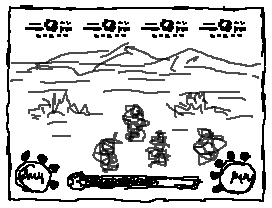
The last screen I'd like to discuss is the one shown when players enter battle mode, and which can be seen above. And for the benefit of both simplicity and visual cohesiveness, I'd keep everything very similar to what happens in movement mode. As before, the line of character details at the top remains, but the compass and the map are replaced by the battle menus of both players (Player 1 is on the left, and, if present, Player 2 is on the right). I wouldn't change the way these menus work - I think it's a great system the way it is. Except when it comes to submenus: instead of these being displayed in a box, they are shown in the exact same way as the battle menu, with the submenu item icons rotating around the circle and the currently selected item name written inside the circle. (I'd also choose this menu system as the one to be employed when a player wishes to use an item or magic outside of battle, by pressing the X and Y Buttons - see below.) And lastly, centered at the bottom of the screen is the Spirit Points gauge, which I've shown in a slightly exaggerated manner, and which could optionally be made to extend from side to side of the screen, by being placed below both battle menus. When in a ship battle, we only need to add the ship details and the battle grid, which I think looks best if both are side by side at the bottom, each just above the SP bar.
The Controller. I wouldn't make too many changes here, only those neccessary to make controlling a character and a ship a more cohesive experience (especially where movement and camera are concerned), and those to accomodate a two player cooperative mode. The following table tells everything.
| Element | Character | Ship |
|---|---|---|
| Control Stick | Move Character | Steer Ship |
| Control Pad | Up/Down: Swap Weapon Attribute Left/Right: Swap Character | |
| A Button | Action | |
| B Button | Cancel | |
| C Stick (Player 1 Only) | Move Camera (Up and Down also zoom camera) | |
| X Button | Spells Menu | |
| Y Button | Items Menu | |
| Z Button (Player 1 Only) | Center Camera Behind Character/Ship 1st Person View Toggle (if camera is already centered) | |
| Left Trigger | - | Move Ship Backwards |
| Right Trigger | - | Move Ship Forwards |
| Start Button | Player 1: Main Menu (not during battles) Player 2: Join/Leave Game | |
Players can swap characters even when controlling the boat, but only the player who is currently in charge of the character at the helm can steer it! (That character must activate the helm in order to be able to do so.) And notice that the biggest difference here from the actual game is the fact that the Control Stick doesn't move the ship, it simply defines the direction of movement. To actually displace it, the Left and Right Triggers are used. Why did I choose to make this so? Well, it's all a matter of consistency: if, while on foot, both axis of the Control Stick do the same task (they move the character), why should they do different things while in ship mode (one axis moves and the other one turns the vessel)? By assigning the Triggers to move the ship, the Control Stick functions in a more consistent manner. And because Skies of Arcadia Legends is a third person adventure, I think it is important for players to have a good camera control system, with very dynamic and unrestricted movement, but also with adequately balanced zooming capabilities, and all this even when inside houses. I'd allow this behaviour to be promptly accessed by Player 1 from the C Stick and the Z Button, wether that player is controlling a character or a ship.
Last Words. The modifications I've outlined here for this game are all more of a technical nature than in my other pages - I truly like the story and the characters and most of the locations in this game, so I felt no need to rework those! These changes are simply a rather vague representation of how I think turn-based RPGs should function, especially where trying to establish a credible atmosphere and a consistent gameplay structure are concerned.
Copyright © 2004 Rui Cuco. All rights reserved.
All trademarks mentioned in these pages belong to their respective owners.